As a student of the Diploma in Accessibility and Usability, we are given the UX research carried out by another student team so that we can design a solution to the problems encountered.
UX/UI Designer
5 meses
Agenda - AYU (UTN)
Having a limited period of time, we decided to adjust the roadmap considering it a starting point. We define a qualitative and quantitative methodology, in order to propose a solution for users and test to achieve an iteration and a more suitable final product.
1.Research questions
2.Definition of objectives
3. Hypothesis
4.GScript and user interviews
5.Interviews analysis
6.Insights and UX Design
The research questions are oriented to define the objectives of the investigation. We leave of a general question and then those that have to do with the epistemological objectives are specified.
How could we help improve people's emotional well-being?

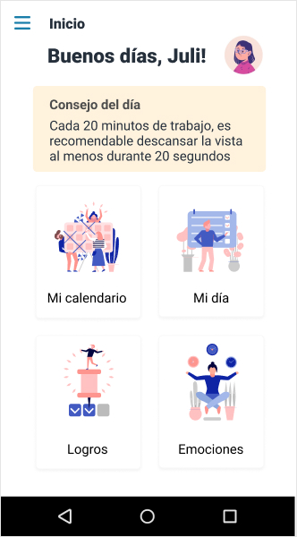
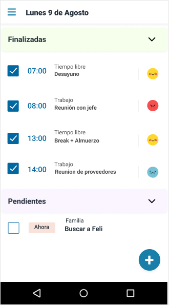
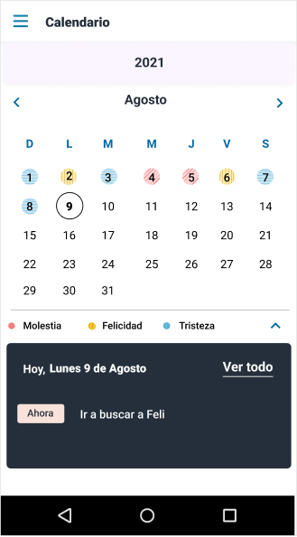
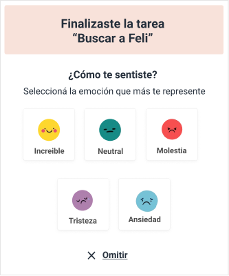
An agenda where you can organize your different daily tasks and assign them emotions, thus allowing you to track which ones generate positive feelings, and encourage you to modify the routine and maintain these activities to improve the personal well-being of the user.
Have an organization space.
Encourage good habits.
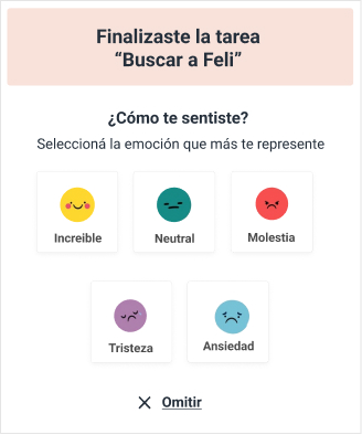
Facilitate emotion recognition.
Link emotions with activities.
Give a detailed analysis of personal routine and help improve it.
The userflow was designed for the MVP that considers the main action of the user. The objective was to validate this with tests and then expand the actions that can be carried out in the application.
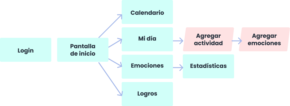
We had three design stages with testing in between each of them. The objective was to test within the first stages to adjust the design as it progressed and save production costs.
First round: 5 users were tested
First iteration, second round: 5 users were tested, people with disabilities were included.

Second iteration, third round: 5 users were tested, people with disabilities were included.
Through successive rounds of testing, two of which were conducted with people with disabilities, we were able to find out what was most important to users and adjust them in the design over the different iterations:
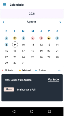
Initially, the calendar was the main screen.
People were not clear what to do since they lacked context of the functionalities that the app has.

An initial context screen was included so that the user knows the possibilities of the app.
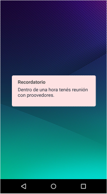
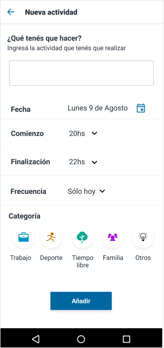
The functionality of adding alarms and reminders of activities for when the app works in the background was considered.
The alarm increased users' anxiety instead of reducing it.
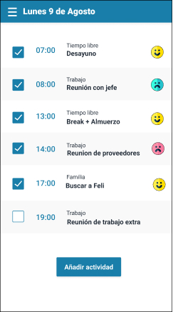
The alarm was removed and added a reminder of upcoming activities in the calendar.
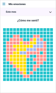
One of the initial ideas was to include a "pixel year" where the user had an illustration made with n pixels formed with the colors of the emotions that predominated in their activities.
"Pixel year" and artwork to complete screens were ignored by users. It was also not very accessible because it was color dependent.
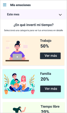
Was changed to a data and statistics screen that is less "artistic" but has a more specific utility for users

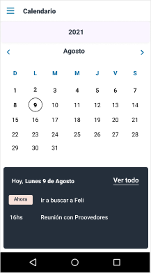
At the beginning, the schedules were used in 12h time format.
In tests with users, some of them had difficulties to understand if the schedule belonged to AM or PM, therefore it was not very accessible.
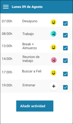
The time format was changed to 24hs.
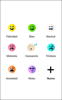
At the beginning of the process, it had been considered to have a button so that the user can assign emotions that are outside the default ones.
Users were ignoring this feature, using the default ones as they were broader and less specific.
This functionality has been removed and the defaults have been redesigned to be even more extensive.

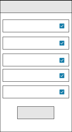
In the first round of testing, the activity checkboxes were placed on the right following the reading order.
It confused users as they did not understand that they should interact with first.
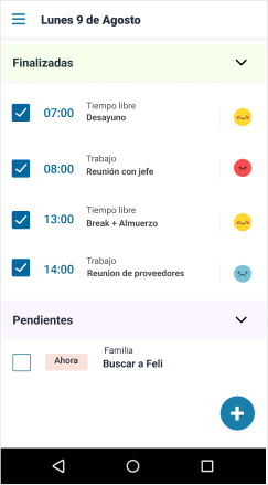
They moved to the left and in this way they were in a position opposite to the emotions.