In 2021, the Legislative Elections were held in Argentina. The request was to design interactives to show the results in real time for the STEP (September) and General (November)
UX/UI Designer
2 months
Página 12 / Am 750 / IP digital
The Argentine legislative elections involve several aspects that are quite complex for people who are not internalized in electoral processes. Our objetive it was communicated in a simple way
Our objective was to create dynamic and interactive pieces to generate greater interactions and visibility on websites.
Improve the audience of Página 12 on election day and compete directly with other media that have been using interactives for years
Since we had extremely short time, we decided to divide our roadmap into two instances: The first includes the STEP elections. For them we dedicate ourselves exclusively to the work of synthesizing information and interface design. Once the first are finished, we propose a quantitative analysis with monitoring tools and "guerrilla" testing to implement improvements on November.
1.Studyin electoral process
2.Synthesize information
3.Define users
4.Widget design
5.Guerrilla tests
6.Iteration

These are people who regularly read Page 12. They do not have specific knowledge of the electoral system. They want to see the results in real time.

They are people with a deeper interest in the results. They understand about electoral positions either out of interest or because it is part of their job. They want to know as much data as possible.
*Based on hypothesis
We carry out a study and organization of the information in order to establish levels of complexity in the data shown and to decide what chart format was better suited to the information we were going to show. The data we wanted to show to our users were:
We call "the first layer" to that information that the user needs to understand with a single glance. It is oriented to quick access to information. It does not have much depth in the data.
"Second layer" involves those widgets that have detailed information. Consider the user who have time to read and you can go deeper into the data if he/she wants to. It has a great visual impact and invites the user to use it.
It involves simple information that is not directly associated with the current election but rather it is intended to provide context. They have less visual hierarchy and are designed to complement informative notes written by journalists.
We designed 5 widgets in all and one special embeddable on the front pages and on the internal pages. Each of them aimed to explain a different type of information.
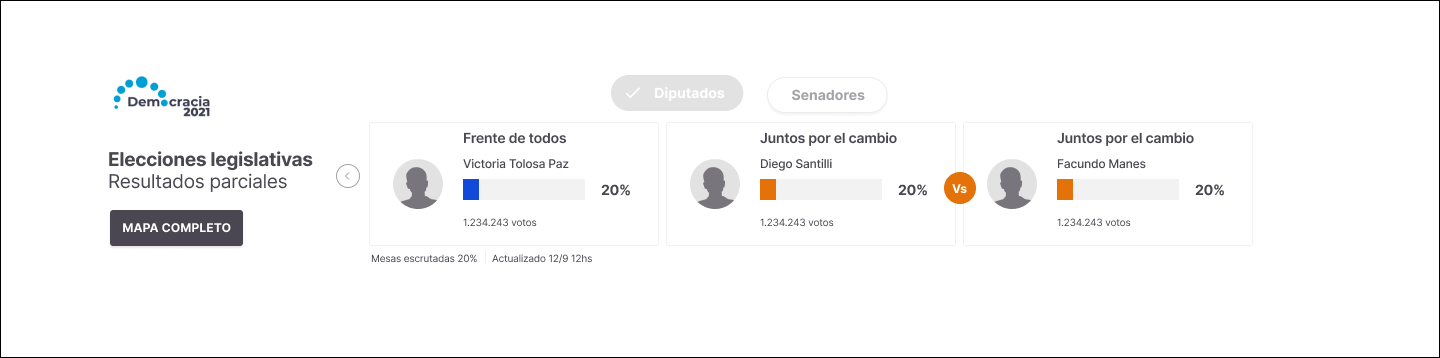
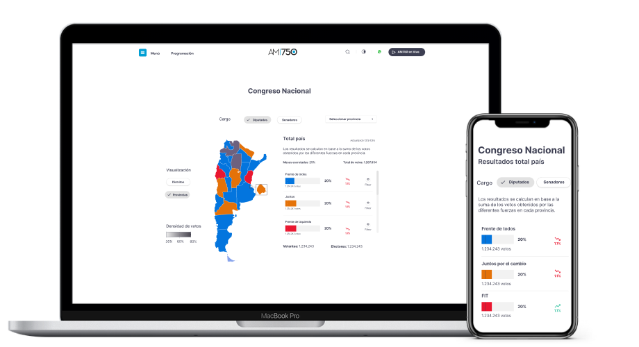
We needed a widget that could show live results as soon as the user entered the site in order to capture and retain the audience. For this, we decided to make a widget (Horizontal end desktop and vertical on mobile) that would show the candidates that were winning and the percentage of votes.
It is placed at the top, below the navbar and is replicated in all the internal pages of the website
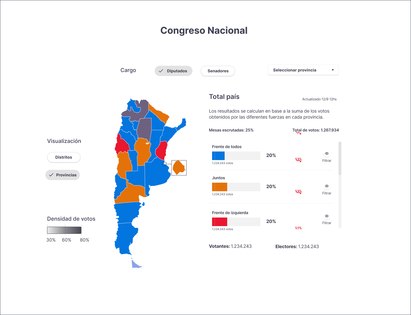
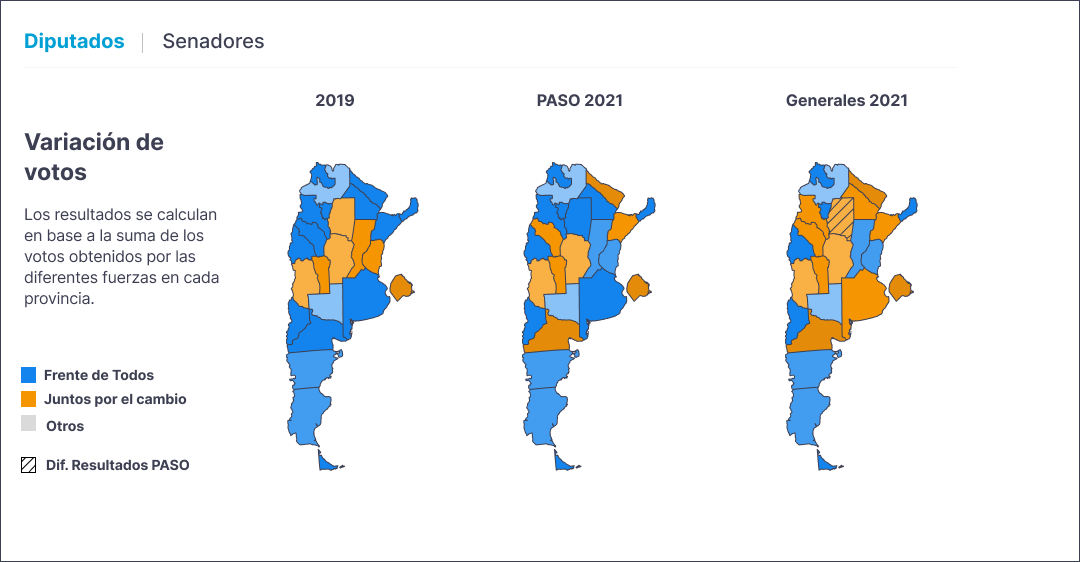
The objective of the Map is to be able to show the results by geographic location and give the user a greater depth of data about the elections. It is intended for the user who has more time to navigate and can access more specific data as they interact with the widget.
It is placed as a "full-width" widget at home page
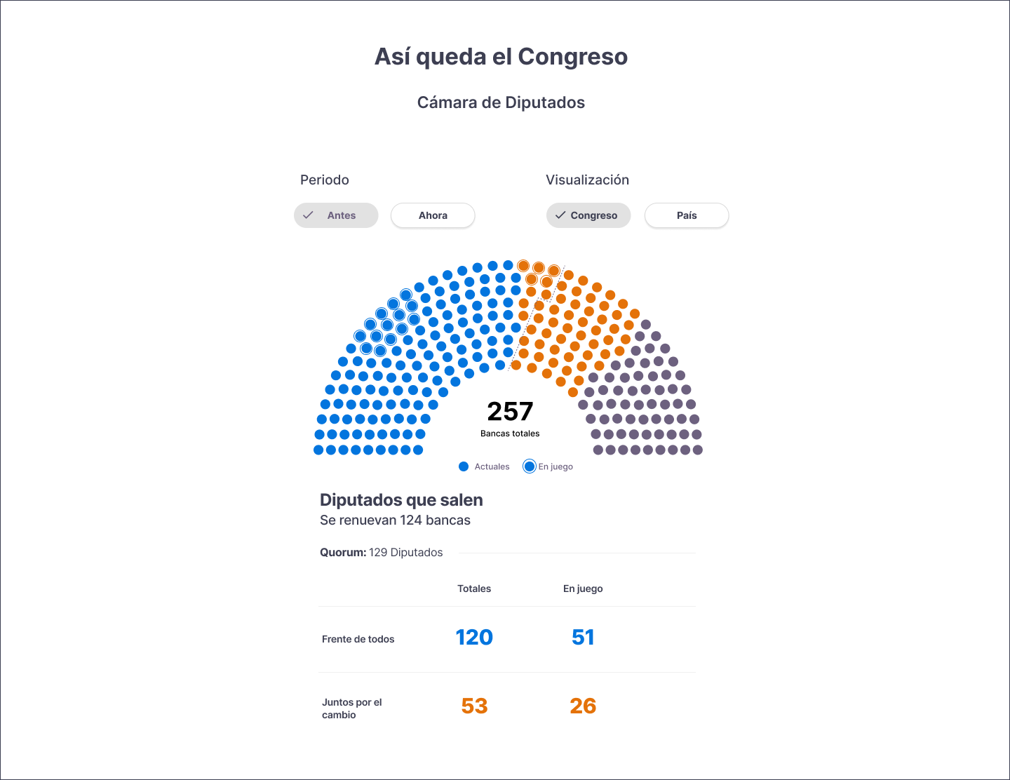
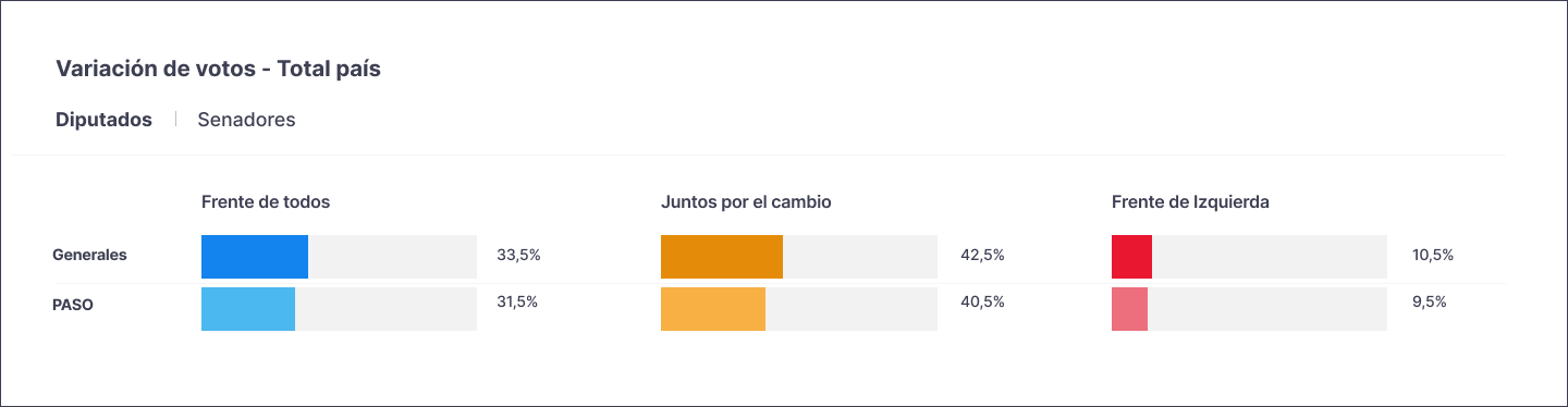
This widget shows the situation of the chambers of Congress. It is possible to compare which party has the majority in each of them and, in turn, see the seats at stake, won and lost.
Toma posición en tamaño full-width y puede ir en la home o en las internas
The products of this level aim to complement the information within a journalistic note. It has a more illustrative sense and low depth in data.
It is used in internal note. It can be applied anywhere along the length of the text.
For reasons of time, only "guerrilla" tests were carried out aimed at the profile of users linked to journalists. The widgets belonging to the second layer, which are the ones that contained a greater density of information, were tested.
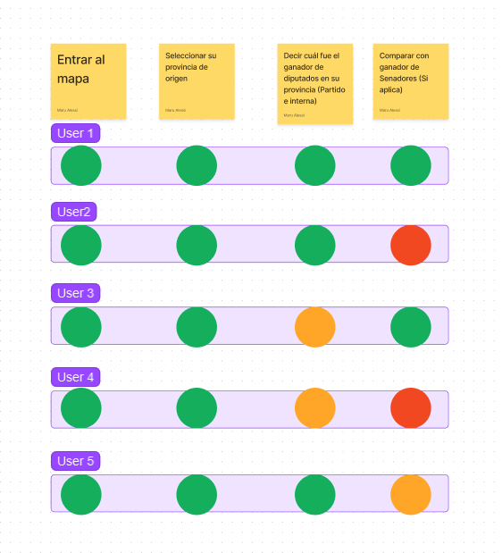
Tasks that users couldn't do without help got 40-60% conversion. They were mostly linked to the comparative aspects of information. A 1-5 severity criteria was established to prioritize adjustments.